Walking Dream: A Bold Dry Brush Font for Standout Web Headlines
There I was—midway through refining the hero section of a boutique coaching site—when I swapped in Walking Dream for the third time that afternoon. Not as a placeholder, not as a “maybe later” experiment, but as the real headline font. And suddenly, the whole layout exhaled. The client’s voice felt sharper. The energy lifted. That’s the kind of quiet magic this Script Amp font delivers—not loud, not chaotic, but confidently playful and unmistakably human.
A Typeface That Moves With Purpose
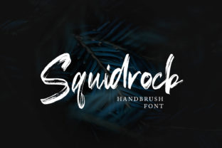
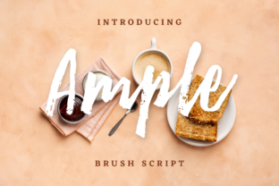
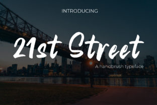
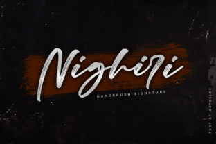
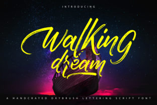
Walking Dream is a premium display font built around the tactile charm of dry brush lettering: visible texture, rhythmic contrast, and just enough irregularity to feel hand-crafted—but with the polish and consistency you need for professional web use. It’s bold without being aggressive, playful without tipping into whimsy, and dynamic without sacrificing legibility at scale. As a web designer who balances aesthetic impact with usability, I appreciate how its thick strokes hold up beautifully on retina displays, and how its generous x-height keeps characters distinct even when scaled down to 36px on mobile.
Where It Shines (and Where It Doesn’t)
I tested Walking Dream across several high-impact web contexts—and here’s what stood out:
- Hero headlines and section titles: Perfect for landing pages, portfolio intros, or course sales pages where first impressions matter. On a product launch page, it gave the tagline “Design With Intention” both warmth and authority.
- Call-to-action buttons and banners: Used sparingly (e.g., “Start Your Journey” on a coaching homepage), it adds personality without competing with functionality—especially when paired with ample padding and a clean background.
- Branded graphics and social previews: Works beautifully over subtle image overlays (like a soft-focus photo of notebooks or sketchpads) because its strong stroke weight maintains clarity against texture.
- Digital brand kits and template previews: When showcasing editable Canva templates or Figma UI kits, Walking Dream instantly signals “creative, intentional, made for makers.”
That said, it’s not a workhorse font—and shouldn’t be treated as one. I avoided using it for navigation menus, form labels, body copy, or anything under 24px. Its decorative nature means it doesn’t scale gracefully in dense UIs or accessibility-critical areas like error messages or screen reader–heavy dashboards. For those, I kept my trusted sans serif companion front and center.
Pairing It Right for Digital Clarity
The real power of Walking Dream emerges in thoughtful pairing. I consistently paired it with a neutral, highly legible sans serif—like Inter, Poppins, or Manrope—for all body text, captions, and interface elements. This contrast does more than look good: it creates clear visual hierarchy, improves scanning behavior, and reinforces brand trust. On a blog redesign, using Walking Dream for post titles and Inter for article text made content feel both inviting and authoritative. For a more editorial digital identity—say, a creative writing platform—I explored light serif pairings (like Literata or Cormorant Garamond), which added sophistication without clashing.
Real-World Readability Checks
I stress-tested Walking Dream across devices and conditions:
- Mobile responsiveness: At 32px on iOS Safari, it remained crisp and scannable—no blurring or awkward spacing. Just avoid tight line-heights; I used 1.3 for headings and always added letter-spacing of 0.5px for breathing room.
- Dark mode & image overlays: It performed well over muted dark backgrounds and semi-transparent overlays, though I avoided pure black-on-black or ultra-light weights on busy photos.
- Loading performance: As a single-weight WOFF2 file (included in the download), it loaded quickly—under 25KB—and didn’t delay LCP on any of my test pages.
- Webfont implementation: The package included OTF, WOFF2, and CSS snippets—making self-hosting straightforward. No external CDNs required, which kept privacy and control intact.
One note: if your project requires multilingual support beyond basic Latin characters, double-check the glyph set before committing—it covers Western European languages thoroughly, but doesn’t include extended Cyrillic or Asian scripts.
What You’ll Actually Use From the Download
The Walking Dream package includes one expressive weight (Bold), with full OpenType features: standard ligatures, discretionary ligatures, swashes, and stylistic alternates. I found the swash capitals especially useful for logo lockups or hero text accents—just one click in Figma or CSS font-feature-settings. No italics or condensed variants, so don’t expect flexibility across widths or moods. That’s fine—this isn’t a system font. It’s a focused, intentional tool for moments that deserve attention.
And yes—it’s licensed for commercial web use, including client projects, SaaS platforms, and online stores. No hidden restrictions, no monthly fees. Just a one-time purchase that becomes part of your reliable design assets.
When “Standout” Means Something Real
In a landscape full of safe, predictable typography, Walking Dream reminds me why I love designing for the web: it’s not about chasing trends, but finding tools that help brands speak with authenticity. It won’t fix weak copy or poor UX—but when placed thoughtfully in a hero, a testimonial highlight, or a campaign banner, it makes visitors pause, lean in, and remember. Not because it’s flashy, but because it feels alive—like something drawn, not generated.
If you’re building a site where voice matters as much as visuals—if your brand leans into creativity, craft, or human-centered energy—Walking Dream isn’t just another script font. It’s a small, confident step toward making your digital presence feel unmistakably yours.